that is unfortunate. icons having a variety of silhouettes makes it easier to identify them and gives things a little personality.
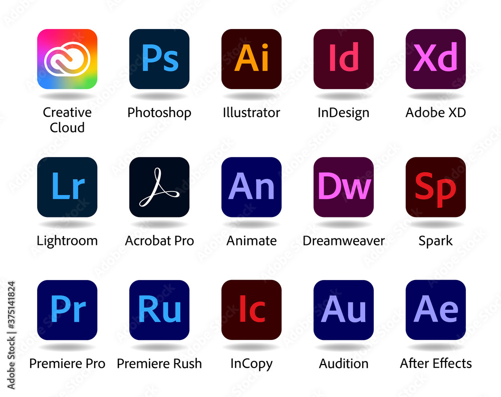
Adobe app icons are really the poster child for icons that are difficult to identify: https://as1.ftcdn.net/jpg/03/75/14/18/1000_F_375141824_Urr3G...
Icons were not meant to be text to read.
Take a look at the icons for Google’s mobile apps.
Oh, that redesign was ludicrous https://nathanboomsma.medium.com/why-googles-new-logos-suck-...
I am in general quite dismayed with macOS becoming more and more iOS-like. There is a reason the two operating systems were different, and it was quite nice, to be honest. Not to say that I don't like sharing the liquid glass design language, but stuff like this this forced squircle is really sad to me, too.
I feel like that's the crux of everything that sucks about computing these days: everything tending toward the lowest common denominator of a smartphone UI and a cheap whore of a webpage
I'd like someone running macOS 26 to weigh in here, but I'm not sure it's true that - if you replace an app icon (presumably by pasting in the Finder Get Info window) - the replacement is also confined to squircle jail?
no.
[dead]
> Apps that haven’t been updated with Tahoe-compliant everything-fits-in-a-squircle icons are put in “squircle jail” — their non-Tahoe-compliant icons are shrunk and placed atop a drab gray Tahoe squircle background, to force them into squircle compliance.
I've been replacing some app icons with their older, non-square versions for years (Firefox is probably my favorite). Will be disappointing to lose that option -- I've never understood why Apple feels the need to standardize app icons like this.