__float parent
What in microtype makes "a big difference"? I don't recall using it (my LaTeX years are long behind me), but all of the examples on https://www.khirevich.com/latex/microtype/ seem incredibly minor. I don't think I'd notice any of them as the reader.
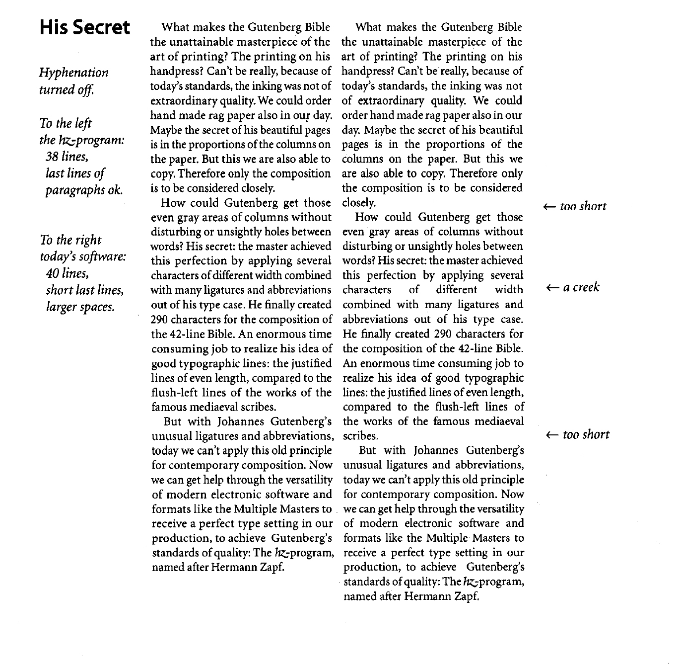
It will tweak spacing, kerning, margin protrusion, and font size to improve readability avoid big word gaps and excessive end-of-line hyphenation.
It is what sets professional typography apart. Only Adobe InDesign provides a comparable implementation, tweaking all those details.
See https://en.wikipedia.org/wiki/Hz-program for a better explanation and an example.
IMHO, the difference is obvious and not minor. Without microtypography texts look ugly: https://upload.wikimedia.org/wikipedia/commons/0/03/Hz_Progr...
Sure, I don't like creeks like in your last example. But I absolutely prefer paragraphs, where the final line would be considered 'too short'. It also makes an appreciable impact for me, in how easy a text is to read.
Which is to say, half of these things are pretty subjective.
> Only Adobe InDesign provides a comparable implementation, tweaking all those details.
TeXmacs claims to have implemented microtypography as well (https://www.texmacs.org/tmweb/home/news.en.html, as I am reading it, in the opening paragraph on version 2.1)
It depends what you're typesetting—if you're using letter/A4 paper with 1" margins, then you're unlikely to notice any difference; but if you're using narrow columns, then it will vastly reduce the number of paragraphs with ugly huge spaces between words. Margin kerning is the other big feature, but you probably won't notice that unless you're fairly picky.