Re: looks, they are admittedly subjective. To my eyes, the difference between the Mac today, and the old Mac, is night and day.
Every Mac OS, starting with 10.7, has visual elements that strike me as sloppy or ugly. The link below has many screenshots from OS X 10.6; I find every element attractive, right down to the last pixel.
I mostly agree with criticisms of modern macOS, especially how it moves randomly closer to iOS, but one thing I disagree is the new Settings. It's still ugly as sin, but it's overall easier to use because everything is uniform (not each panel being its own special snowflake), and MUCH easy to search for. I used to hate it at first, but I got used to it.
But yeah macOS is obviously second fiddle now.
Oh also the + button didn't do full screen as today, but... it did... something. I never understood the point of the + button.
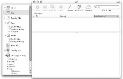
Here's a screenshot https://www.oreilly.com/api/v2/epubs/0596003706/files/tagore...
When I first came from Windows I was confused about this as well, but once I got the hang of it, it became the most logical thing to me.
The green + button zoomed the window to the minimum window size that showed the full content. (For example, one page in a word processor or one slide in presentation software.)
Double clicking the title bar in many applications will also maximize the window.
The app installation is still the same "ikea dmg app dragging", and occasional zip or pkg. The Finder window already has bookmarks in the left bar. The dock behaves identically. (They went through their weird 3D dock phase but that was... Leopard? I think?)
There is no Mac App Store but barely anyone uses this nowadays anyway... Spotlight... was new in Tiger.
It is much more recognisable than Windows XP vs 11. XP behaves very differently to 11!